Button trong bootstrap 5
Chúng ta sẽ tìm hiểu về button (các nút) trong Bootstrap, bao gồm cách tạo các loại button, thiết lập kích thước của button, button có thể click và không thể click hay button thể hiện hành động đang load.
Bài 9: Alert trong Bootstrap 5
Để tạo button trong Bootstrap bạn sẽ sử dụng <button> tùy từng kiểu button bạn sẽ phải sử dụng với class đi kèm. Hãy xem cách tạo chi tiết bên dưới này nhé.
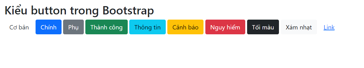
Các kiểu button trong Bootstrap
Bất cứ thứ gì sử dụng class .btn sẽ có giao diện mặc định là một nút màu xám với góc bo tròn. Tuy nhiên, Bootstrap cũng cung cấp các kiểu button với màu sắc khác nhau tương ứng với các class màu trong Bootstrap vậy.
Để dễ hình dung, bạn có thể xem hình ảnh kèm với đoạn code sau:
<button type="button" class="btn">Basic</button>
<button type="button" class="btn btn-primary">Primary</button>
<button type="button" class="btn btn-secondary">Secondary</button>
<button type="button" class="btn btn-success">Success</button>
<button type="button" class="btn btn-info">Info</button>
<button type="button" class="btn btn-warning">Warning</button>
<button type="button" class="btn btn-danger">Danger</button>
<button type="button" class="btn btn-dark">Dark</button>
<button type="button" class="btn btn-light">Light</button>
<button type="button" class="btn btn-link">Link</button>
Để xem các button trên sẽ xuất hiện như thế nào, bạn hãy thử tạo và chạy file .html sau:
<!DOCTYPE html>
<html lang="en">
<head>
  <title>Ví dụ Bootstrap - Sinitc.com</title>
  <meta charset="utf-8">
  <meta name="viewport" content="width=device-width, initial-scale=1">
  <link href="https://cdn.jsdelivr.net/npm/[email protected]/dist/css/bootstrap.min.css" rel="stylesheet">
  <script src="https://cdn.jsdelivr.net/npm/[email protected]/dist/js/bootstrap.bundle.min.js"></script>
</head>
<body>

<div class="container mt-3">
  <h2>Kiểu button trong Bootstrap</h2>
  <button type="button" class=btn>Cơ bản</button>
<button type="button" class="btn btn-primary">Chính</button>
<button type="button" class="btn btn-secondary">Phụ</button>
<button type="button" class="btn btn-success">Thành công</button>
<button type="button" class="btn btn-info">Thông tin</button>
<button type="button" class="btn btn-warning">Cảnh báo</button>
<button type="button" class="btn btn-danger">Nguy hiểm</button>
<button type="button" class="btn btn-dark">Tối màu</button>
<button type="button" class="btn btn-light">Xám nhạt</button>
<button type="button" class="btn btn-link">Link</button>
</div>

</body>
</html>
Khi đó bạn sẽ nhận được các button như hình dưới đây:
Class button có thể được sử dụng trên phần tử <a>, <button> hoặc <input>:
<a href="#" class="btn btn-success">Link Button</a>
<button type="button" class="btn btn-success">Button</button>
<input type="button" class="btn btn-success" value="Input Button">
<input type="submit" class="btn btn-success" value="Submit Button">
<input type="reset" class="btn btn-success" value="Reset Button">
Chạy thử file .html dưới đây để xem kết quả bạn nhé:
<!DOCTYPE html>
<html lang="en">
<head>
<title>Ví dụ Bootstrap - Sinitc.com</title>
<meta charset="utf-8">
<meta name="viewport" content="width=device-width, initial-scale=1">
<link href="https://cdn.jsdelivr.net/npm/[email protected]/dist/css/bootstrap.min.css" rel="stylesheet">
<script src="https://cdn.jsdelivr.net/npm/[email protected]/dist/js/bootstrap.bundle.min.js"></script>
</head>
<body>
<div class="container mt-3">
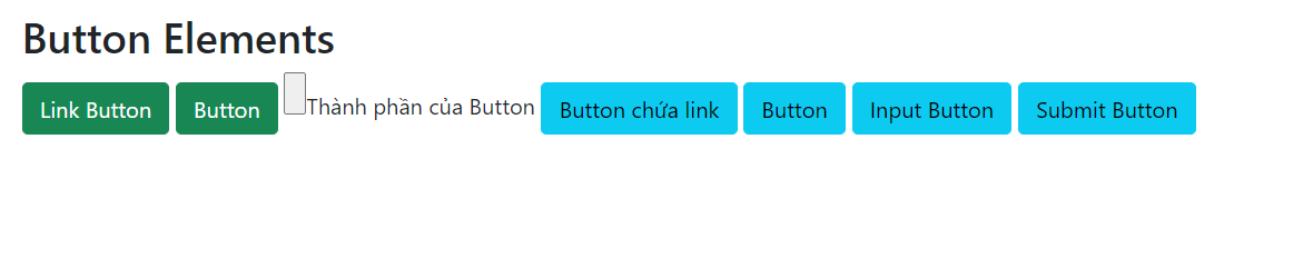
<h2>Button Elements</h2>
<a href="#" class="btn btn-success">Link Button</a>
<button type="button" class="btn btn-success">Button</button>
<input type="button" class=
<h2>Thành phần của Button</h2>
<a href="https://Sinitc.com/" class="btn btn-info" role="button">Button chứa link</a>
<button type="button" class="btn btn-info">Button</button>
<input type="button" class="btn btn-info" value="Input Button">
<input type="submit" class="btn btn-info" value="Submit Button">
</div>
</body>
</html>
Bạn sẽ nhận được các nút như sau:
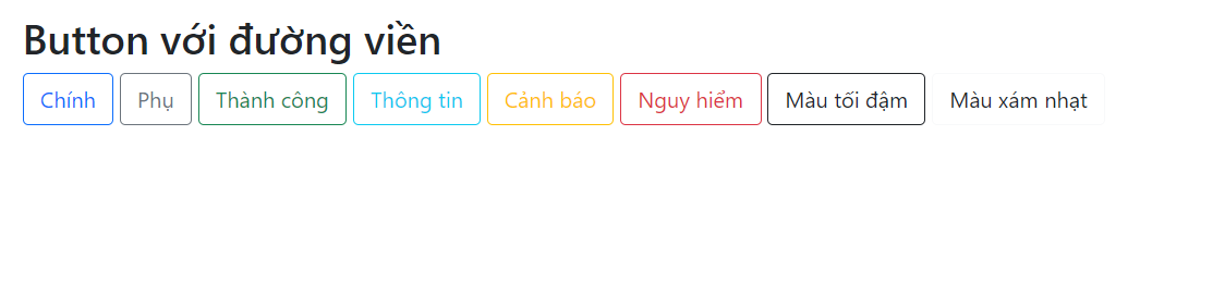
Tạo button chỉ có đường viền
Bootstrap 5 cung cấp 8 định dạng Button chỉ có đường viền, những nút này sẽ xuất hiện như hình chữ nhật bao quanh văn bản, chỉ đến khi bạn di chuột vào nút nó mới được đổ màu. Bạn có thể tạo các nút này với cấu trúc như sau:
<button type="button" class="btn btn-outline-primary">Chính</button>
<button type="button" class="btn btn-outline-secondary">Phụ</button>
<button type="button" class="btn btn-outline-success">Thành công</button>
<button type="button" class="btn btn-outline-info">Thông tin</button>
<button type="button" class="btn btn-outline-warning">Cảnh báo</button>
<button type="button" class="btn btn-outline-danger">Nguy hiểm</button>
<button type="button" class="btn btn-outline-dark">Màu tối đậm</button>
<button type="button" class="btn btn-outline-light text-dark">Màu xám nhạt</button>
Hãy chạy thử đoạn code sau để xem các nút này sẽ xuất hiện như nào bạn nhé:
<!DOCTYPE html>
<html lang="en">
<head>
  <title>Ví dụ Bootstrap - Sinitc.com</title>
  <meta charset="utf-8">
  <meta name="viewport" content="width=device-width, initial-scale=1">
  <link href="https://cdn.jsdelivr.net/npm/[email protected]/dist/css/bootstrap.min.css" rel="stylesheet">
  <script src="https://cdn.jsdelivr.net/npm/[email protected]/dist/js/bootstrap.bundle.min.js"></script>
</head>
<body>

<div class="container mt-3">
  <h2>Button với đường viền</h2>
 <button type="button" class="btn btn-outline-primary">Chính</button>
<button type="button" class="btn btn-outline-secondary">Phụ</button>
<button type="button" class="btn btn-outline-success">Thành công</button>
<button type="button" class="btn btn-outline-info">Thông tin</button>
<button type="button" class="btn btn-outline-warning">Cảnh báo</button>
<button type="button" class="btn btn-outline-danger">Nguy hiểm</button>
<button type="button" class="btn btn-outline-dark">Màu tối đậm</button>
<button type="button" class="btn btn-outline-light text-dark">Màu xám nhạt</button>
</div>

</body>
</html>
Ta sẽ nhận được kết quả như hình dưới đây:
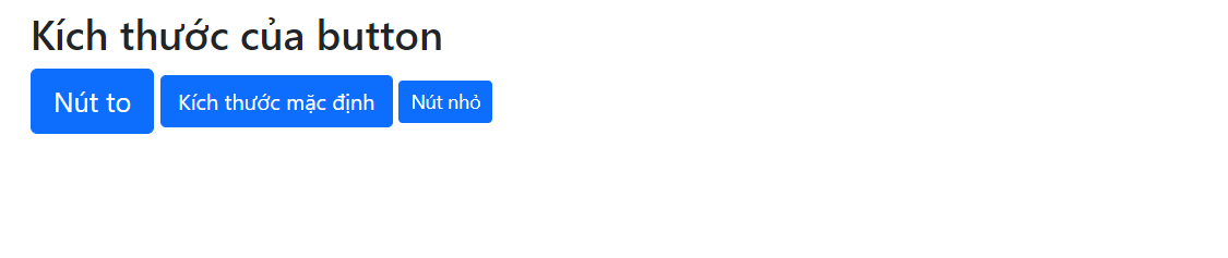
Kích thước của button trong Bootstrap
Bạn có thể sử dụng class .btn-lg cho nút lớn và .btn-sm cho các nút nhỏ:
<button type="button" class="btn btn-primary btn-lg">Nút to</button>
<button type="button" class="btn btn-primary">Nút mặc định</button>
<button type="button" class="btn btn-primary btn-sm">Nút nhỏ</button>
Hãy tạo vào chạy thử file .html này để xem các kích thước của button trong Bootstrap bạn nhé:
<!DOCTYPE html>
<html lang="en">
<head>
  <title>Ví dụ Bootstrap - Sinitc.com</title>
  <meta charset="utf-8">
  <meta name="viewport" content="width=device-width, initial-scale=1">
  <link href="https://cdn.jsdelivr.net/npm/[email protected]/dist/css/bootstrap.min.css" rel="stylesheet">
  <script src="https://cdn.jsdelivr.net/npm/[email protected]/dist/js/bootstrap.bundle.min.js"></script>
</head>
<body>

<div class="container mt-3">
  <h2>Kích thước của button</h2>
  <button type="button" class="btn btn-primary btn-lg">Nút to</button>
<button type="button" class="btn btn-primary">Kích thước mặc định</button>
<button type="button" class="btn btn-primary btn-sm">Nút nhỏ</button>
</div>

</body>
</html>
Khi chạy code trên bạn sẽ nhận được các nút như sau:
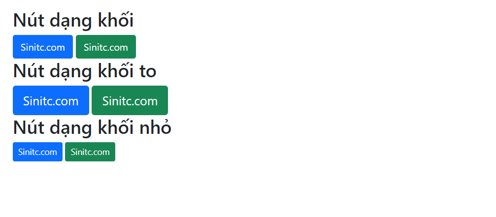
Nút dạng khối
Thêm class .btn-block để tạo nút dạng khối, với độ rộng của nút bằng độ rộng của phần tử cha.
Ví dụ, trong file .html đầy đủ thì sẽ như này:
<!DOCTYPE html>
<html lang="en">
<head>
  <title>Ví dụ Bootstrap - Sinitc.com</title>
  <meta charset="utf-8">
  <meta name="viewport" content="width=device-width, initial-scale=1">
  <link href="https://cdn.jsdelivr.net/npm/[email protected]/dist/css/bootstrap.min.css" rel="stylesheet">
  <script src="https://cdn.jsdelivr.net/npm/[email protected]/dist/js/bootstrap.bundle.min.js"></script>
</head>
<body>

<div class="container mt-3">
  <h2>Nút dạng khối</h2>
  <button type="button" class="btn btn-primary btn-block">Sinitc.com</button>
  <button type="button" class="btn btn-success btn-block">Sinitc.com</button>
  <br>

  <h2>Nút dạng khối to</h2>
  <button type="button" class="btn btn-primary btn-lg btn-block">Sinitc.com</button>
  <button type="button" class="btn btn-success btn-lg btn-block">Sinitc.com</button>
  <br>

  <h2>Nút dạng khối nhỏ</h2>
  <button type="button" class="btn btn-primary btn-sm btn-block">Sinitc.com</button>
  <button type="button" class="btn btn-success btn-sm btn-block">Sinitc.com</button>
</div>

</body>
</html>
Ta sẽ có các nút dạng khối như thế này:
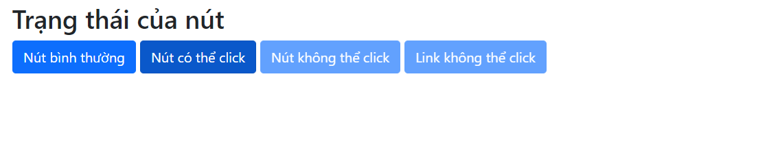
Nút có thể click, không thể click
Bạn có thể thiết lập trạng thái cho nút ở dạng có thể click hoặc không thể click. Class .active sẽ làm cho nút có thể nhấn và thuộc tính disable làm cho nút không thể click. Lưu ý rằng, <a> không hỗ trợ thuộc tính disable và phải sử dụng class .disabled để làm cho nút không thể click.
Khi viết trong file .html thì bạn sẽ code hoàn chỉnh như sau:
<!DOCTYPE html>
<html lang="en">
<head>
  <title>Ví dụ Bootstrap - Sinitc.com</title>
  <meta charset="utf-8">
  <meta name="viewport" content="width=device-width, initial-scale=1">
  <link href="https://cdn.jsdelivr.net/npm/[email protected]/dist/css/bootstrap.min.css" rel="stylesheet">
  <script src="https://cdn.jsdelivr.net/npm/[email protected]/dist/js/bootstrap.bundle.min.js"></script>
</head>
<body>

<div class="container mt-3">
  <h2>Trạng thái của nút</h2>
  <button type="button" class="btn btn-primary">Nút bình thường</button>
  <button type="button" class="btn btn-primary active">Nút có thể click</button>
  <button type="button" class="btn btn-primary" disabled>Nút không thể click</button>
  <a href="#" class="btn btn-primary disabled">Link không thể click</a>
</div>

</body>
</html>
Kết quả hiển thị sẽ như thế này:
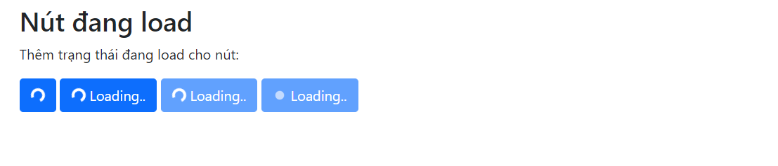
Nút đang load
Bạn có thể thêm trạng thái đang load vào nút bằng cách sử dụng class .spinner-border như ví dụ dưới đây. Chúng ta sẽ có một bài riêng về spinner trong Bootstrap và bạn sẽ biết nhiều cách để tùy chỉnh các spinner này. Dưới đây là spinner cơ bản nhất nhé.
<!DOCTYPE html>
<html>
<head>
  <title>Ví dụ Bootstrap - Sinitc.com</title>
  <meta charset="utf-8">
  <meta name="viewport" content="width=device-width, initial-scale=1">
  <link href="https://cdn.jsdelivr.net/npm/[email protected]/dist/css/bootstrap.min.css" rel="stylesheet">
  <script src="https://cdn.jsdelivr.net/npm/[email protected]/dist/js/bootstrap.bundle.min.js"></script>
</head>
<body>

<div class="container mt-3">
  <h2>Nút đang load</h2>
  <p>Thêm trạng thái đang load cho nút:</p>

  <button class="btn btn-primary">
    <span class="spinner-border spinner-border-sm"></span>
  </button>

  <button class="btn btn-primary">
    <span class="spinner-border spinner-border-sm"></span>
    Loading..
  </button>

  <button class="btn btn-primary" disabled>
    <span class="spinner-border spinner-border-sm"></span>
    Loading..
  </button>

  <button class="btn btn-primary" disabled>
    <span class="spinner-grow spinner-grow-sm"></span>
    Loading..
  </button>
</div>

</body>
</html>
Và đây là kết quả:
Chủ đề Tương tự
- Tags:
Không có đánh giá nào.
Viết một đánh giá.
Để bình luận vui lòng Đăng nhập tài khoản ! hoặcĐăng ký mới!


 S - Tech
 Điện máy
 Khoa học
 Cuộc sống
 Ô tô, Xe máy
 Tiện ích
 Công nghệ
 Video
Video